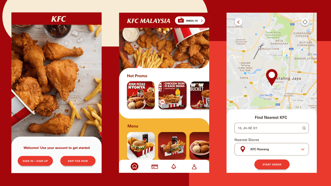
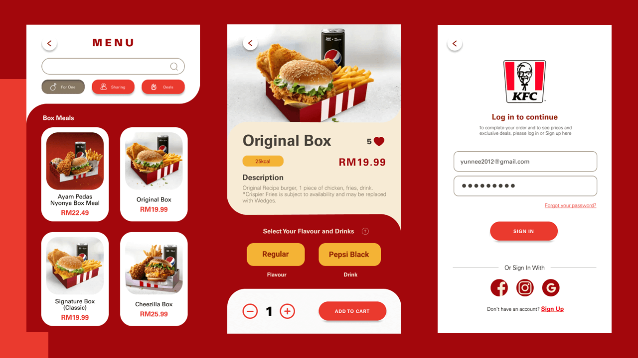
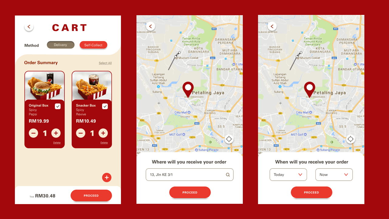
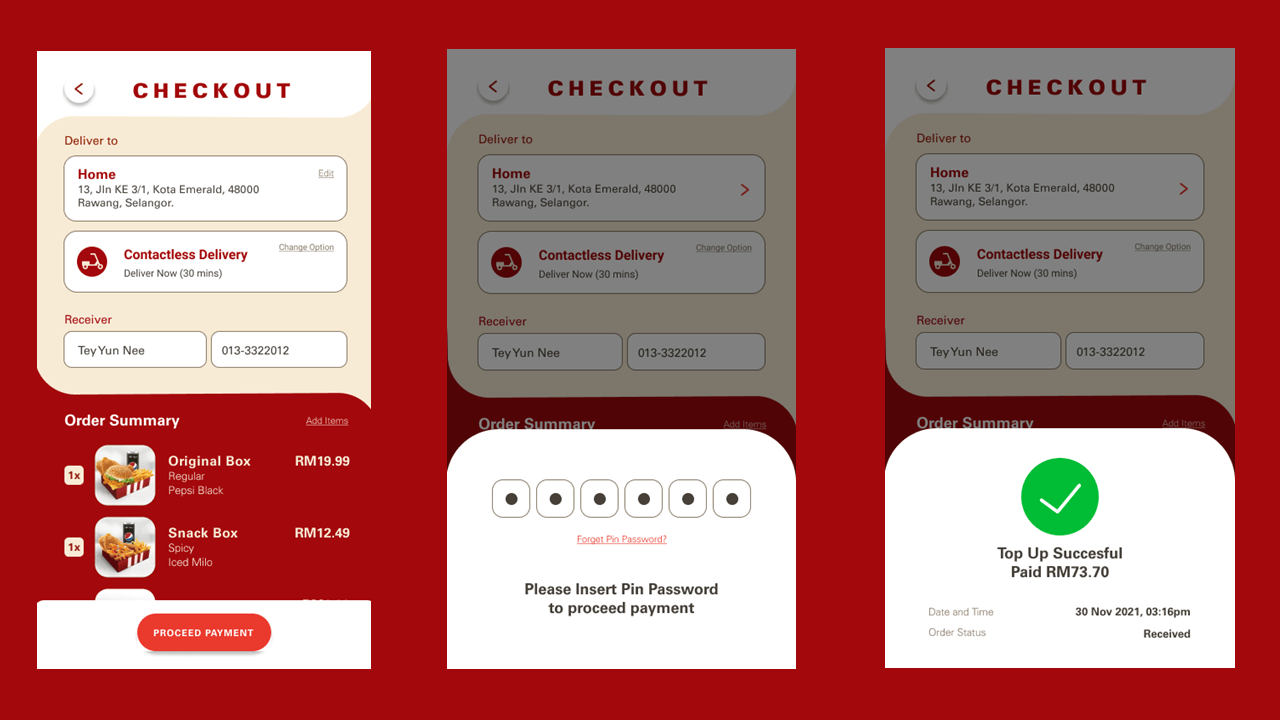
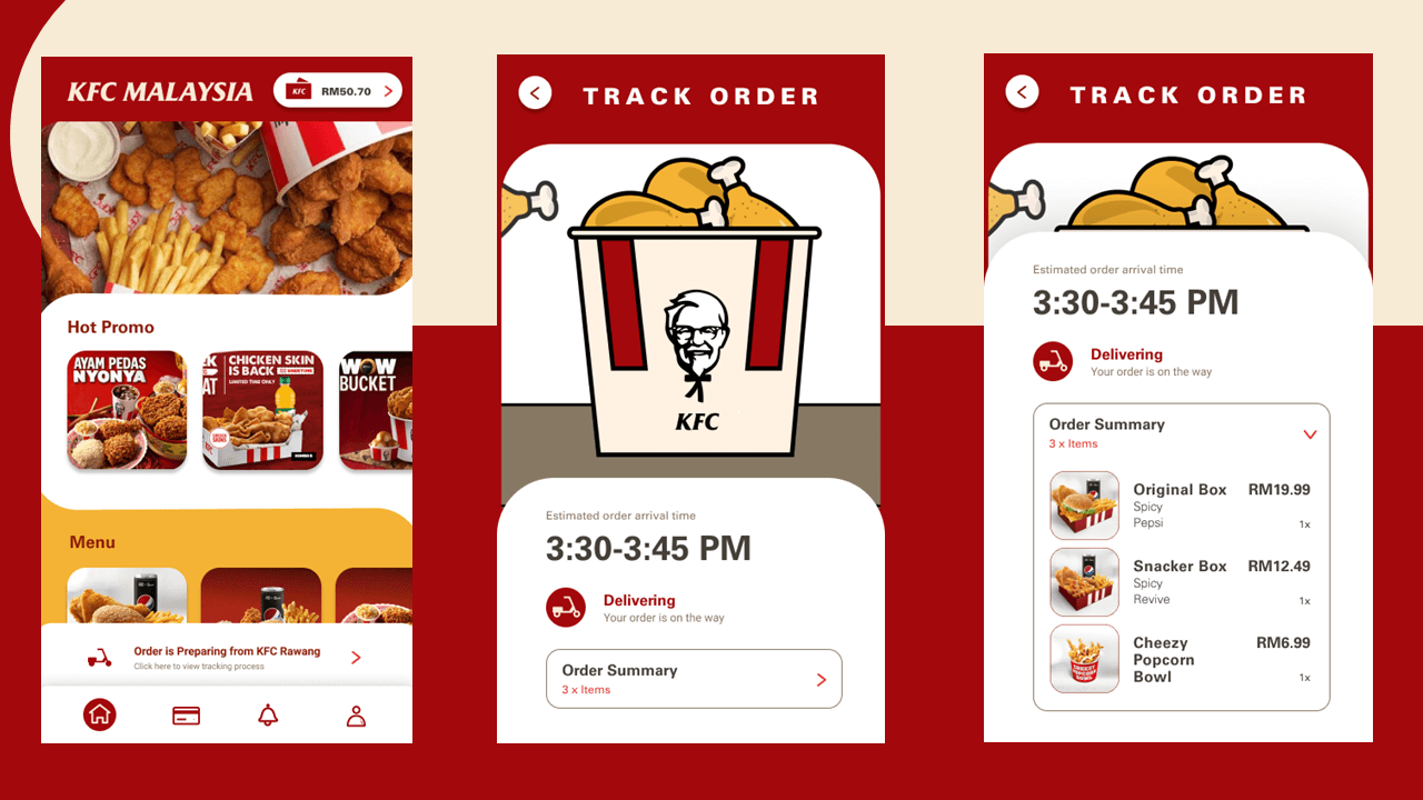
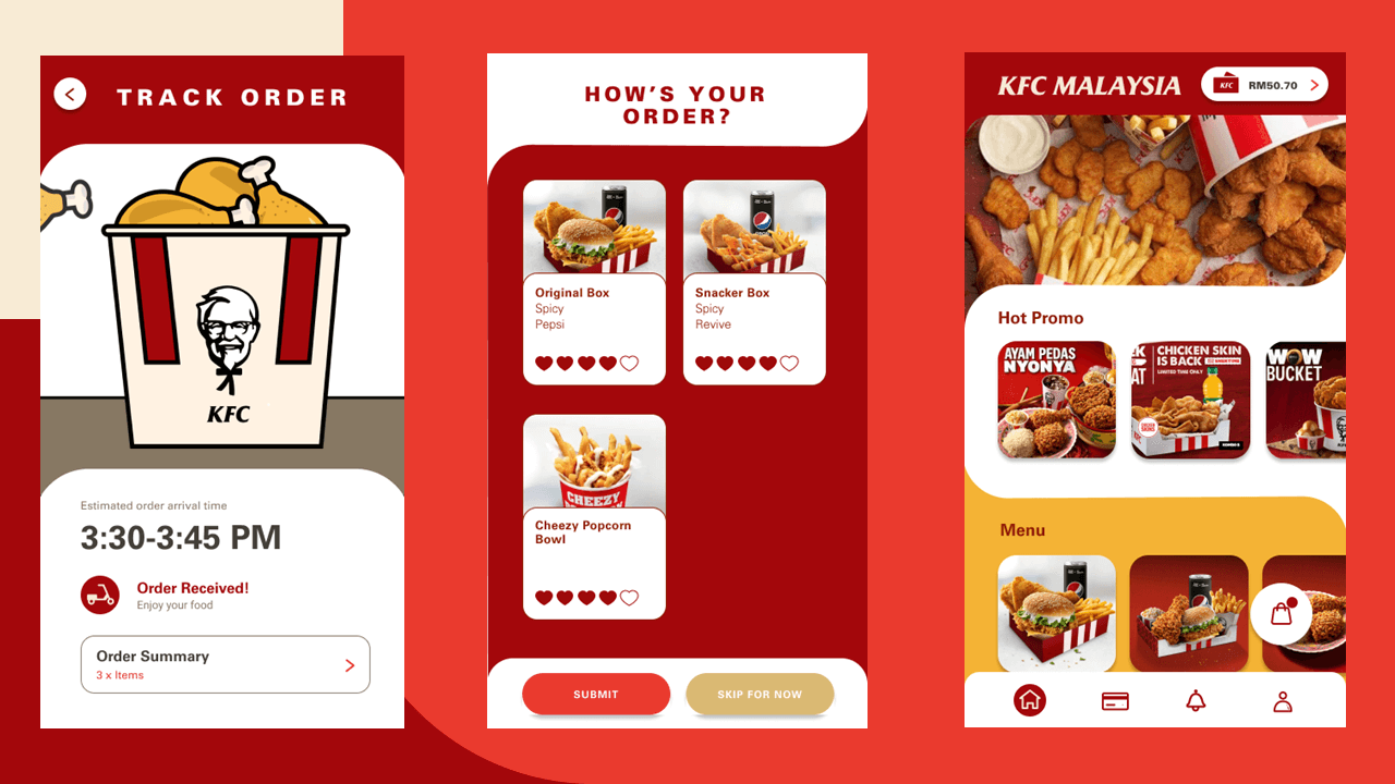
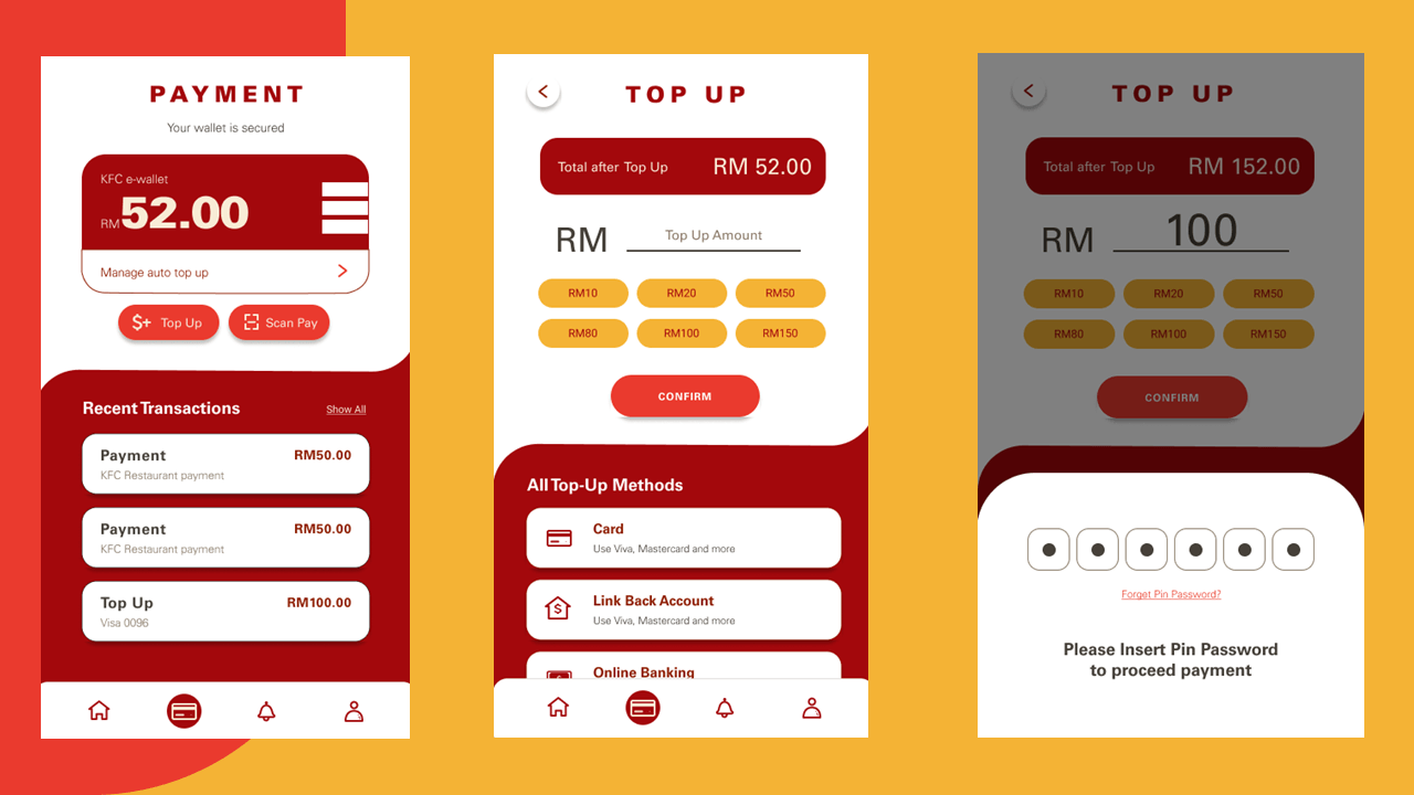
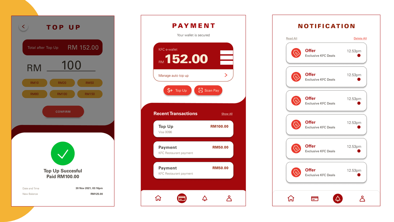
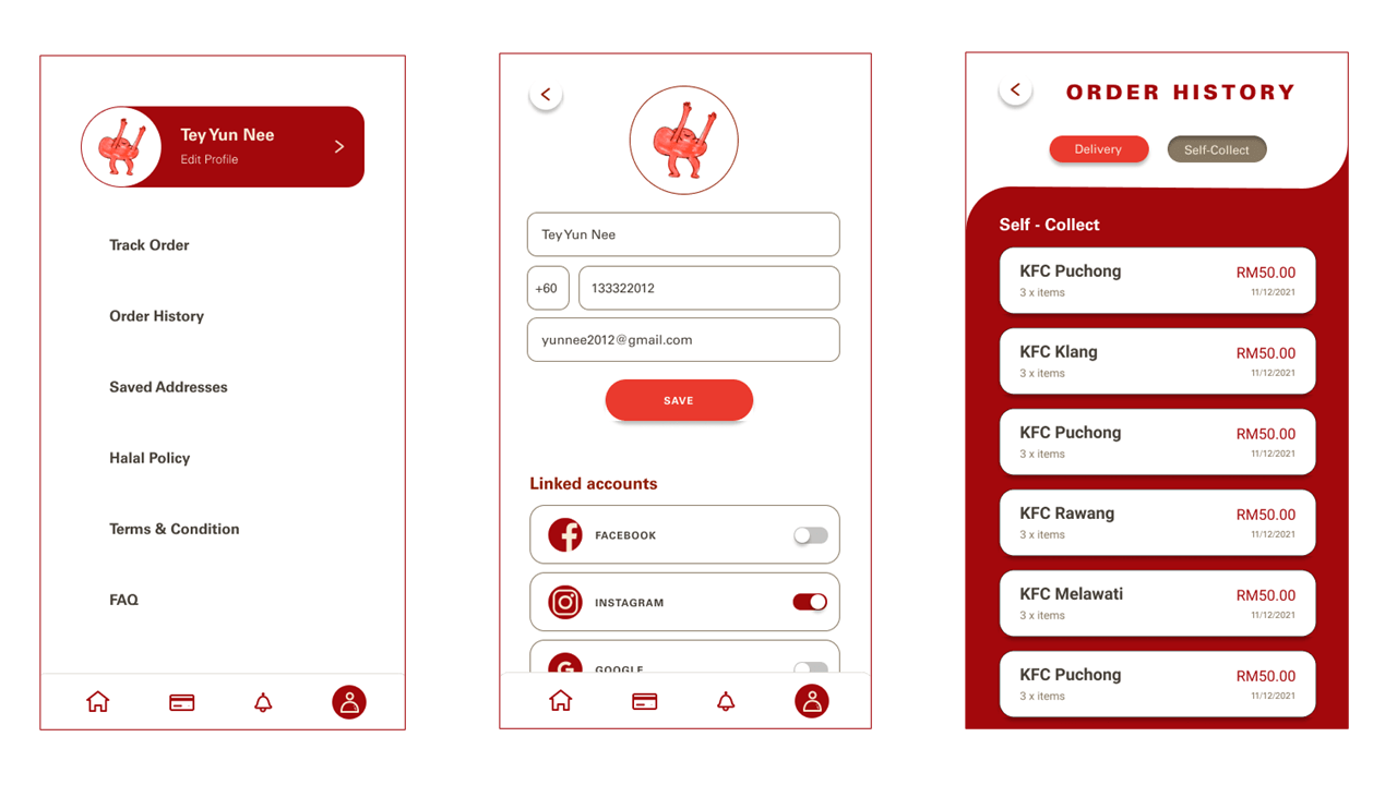
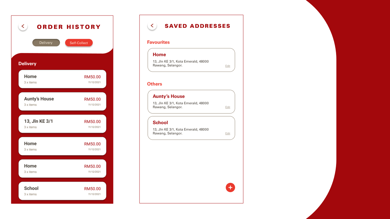
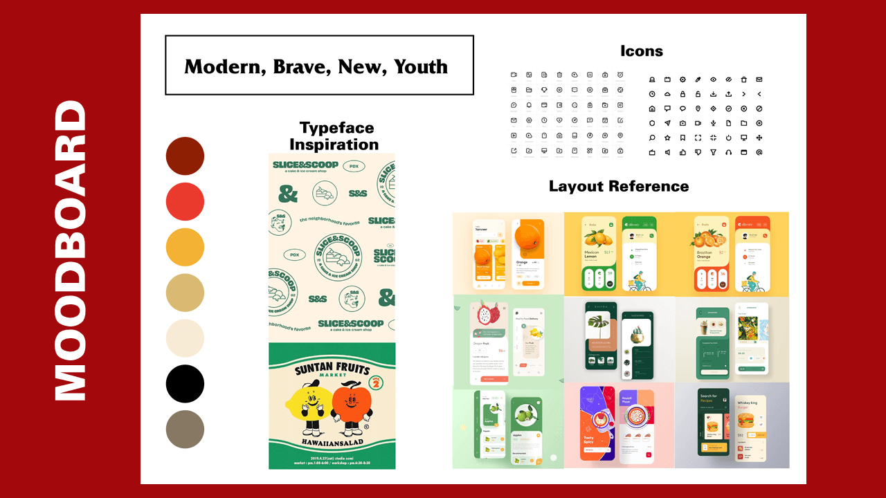
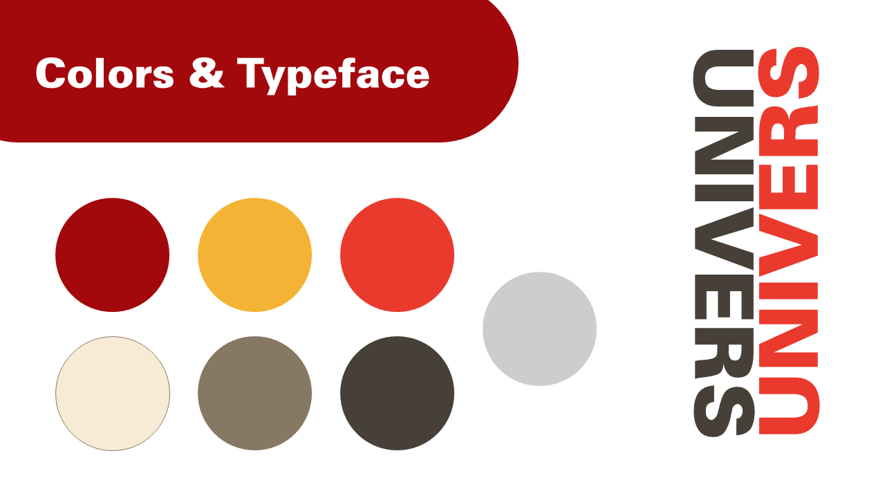
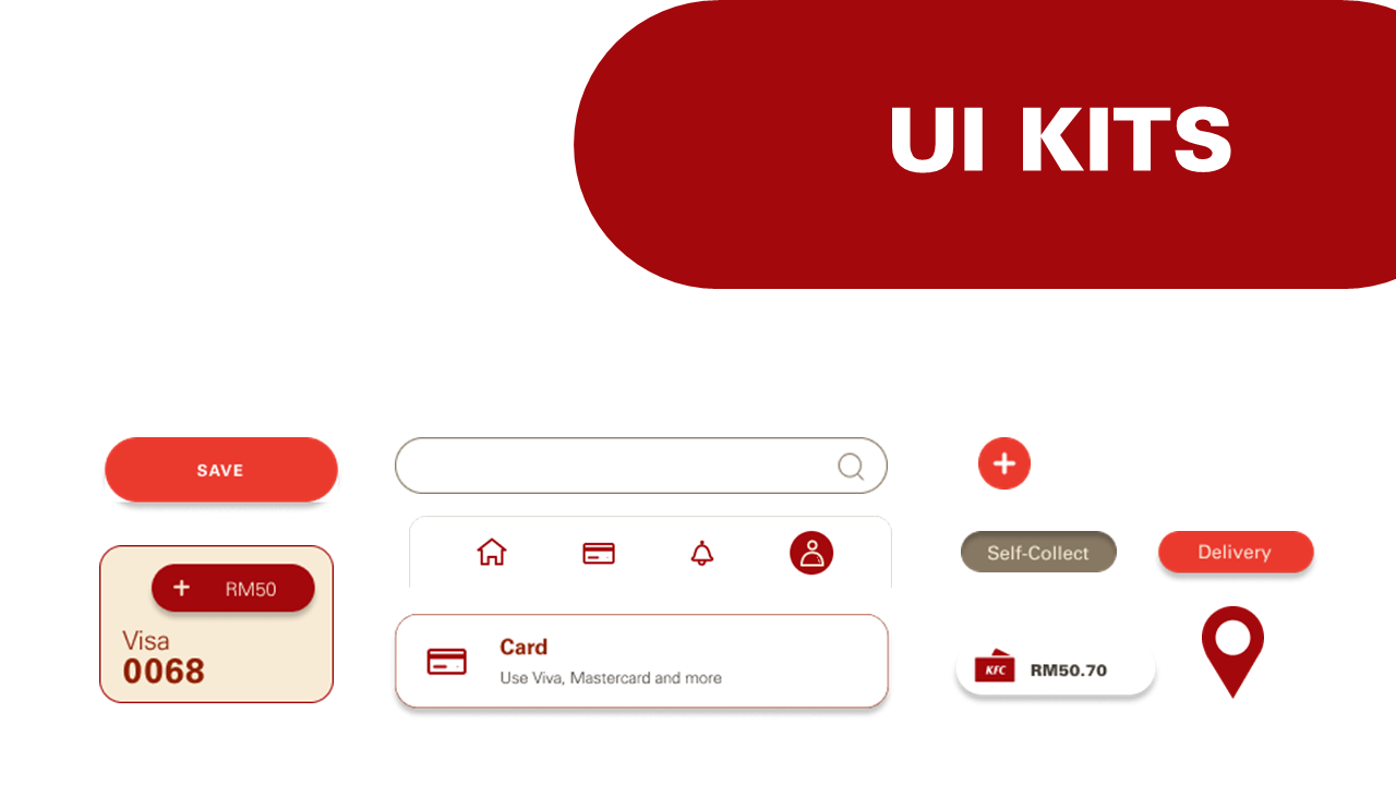
The KFC mobile app redesign project is intended to respond to queries and issues brought up by users in surveys and user testing. In order to stay faithful to KFC’s brand identity, the new design adopts a more whimsical and contemporary style, including overlapping design elements. By making it more simple to use and intuitive, the app redesign aims to enhance the user experience. The updated design includes functions including a streamlined menu, simple navigation, and an intuitive user interface. The app underwent a comprehensive testing process that included user testing and feedback to make sure the new design satisfies user needs. This gave the team the chance to spot any problems or locations where users were confused by the app and then make the required changes to enhance the user experience. Along with adding intrigue and user engagement, the new design also includes whimsical aspects like overlapping design components and entertaining animations. These components contribute to a lively and contemporary atmosphere that is consistent with KFC’s brand image. The primary colours of KFC are still used to retain brand identity and awareness despite the humorous design elements. This applies to any instances where the recognizable red and white colour scheme and the KFC emblem are used.