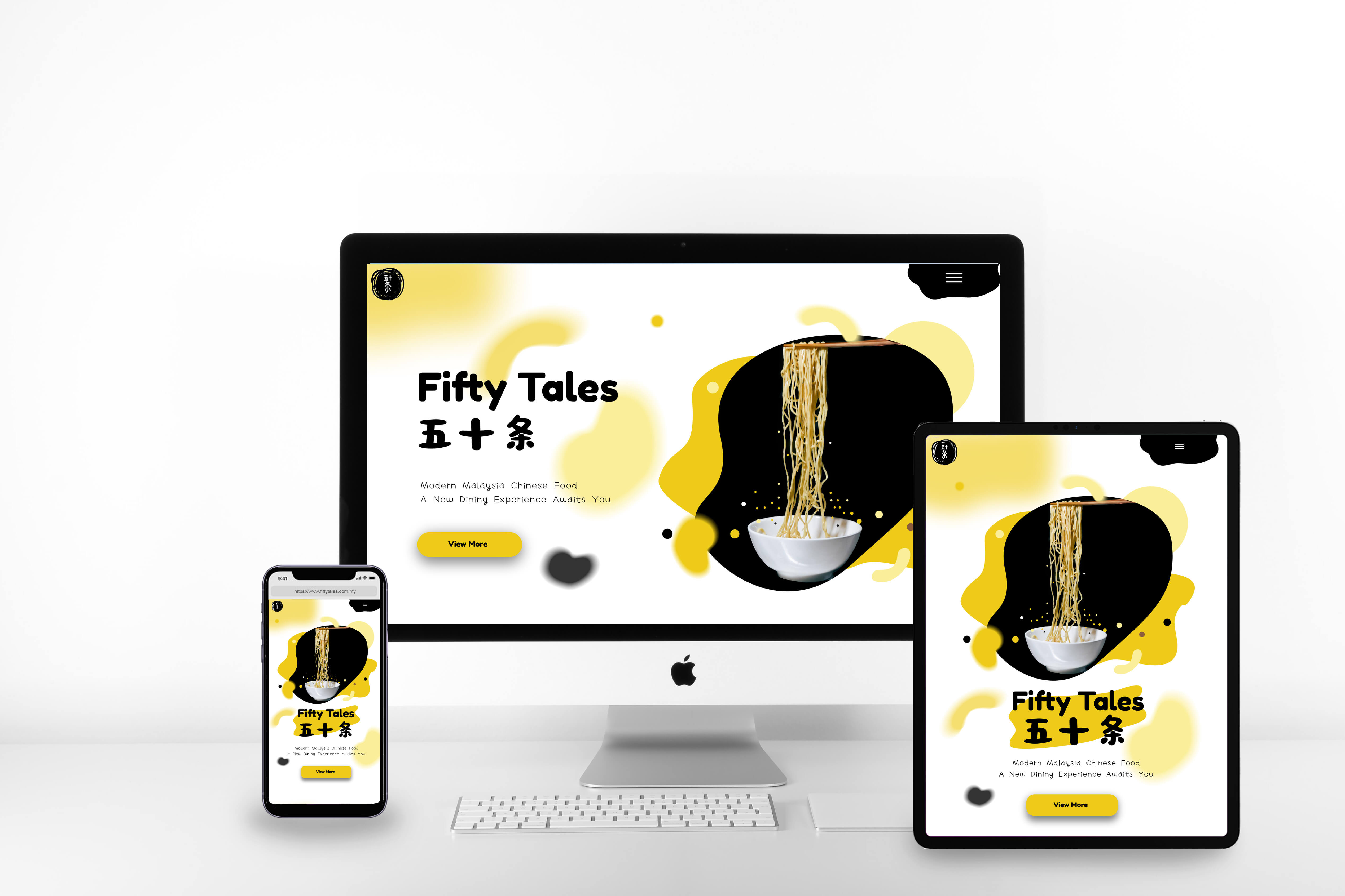
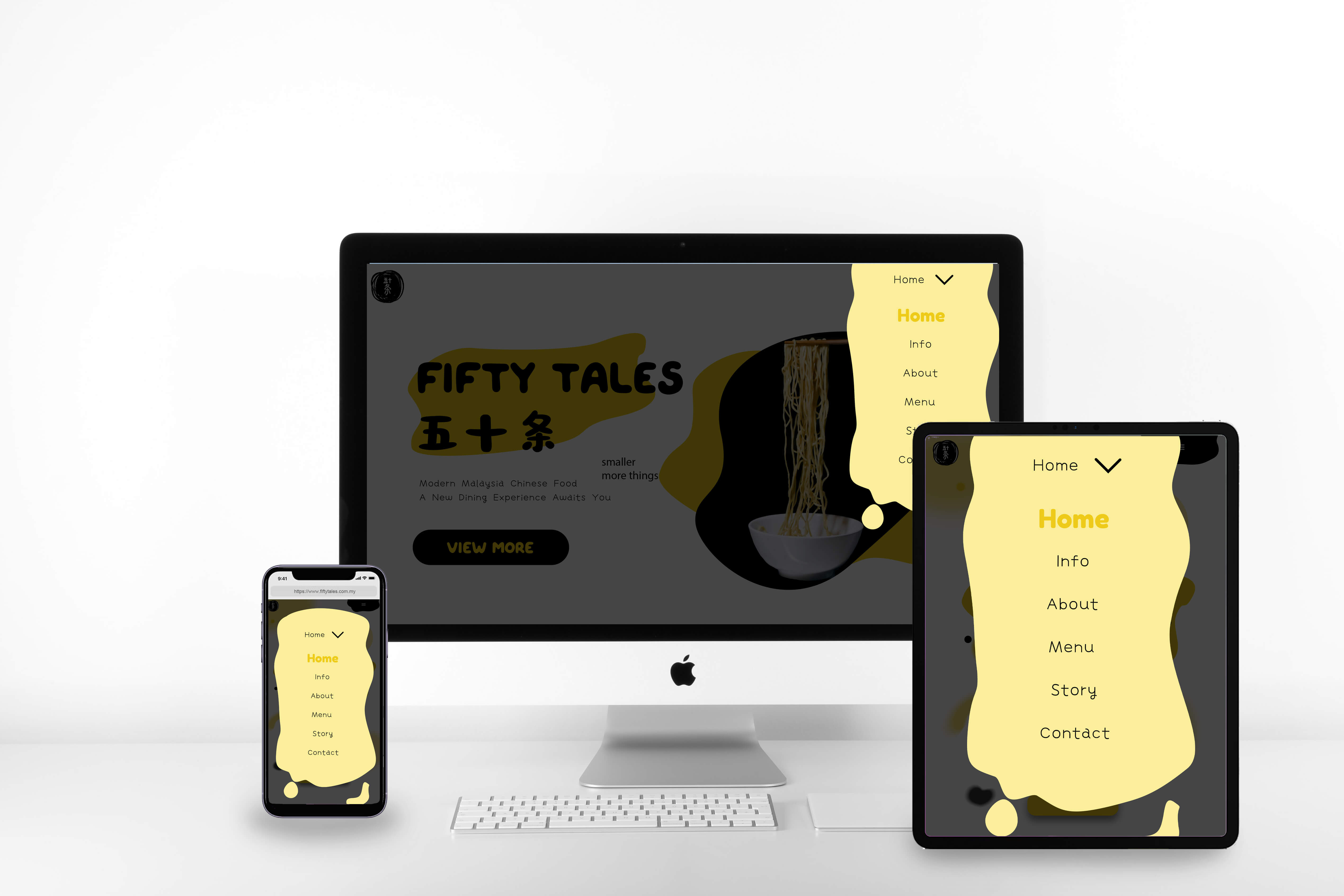
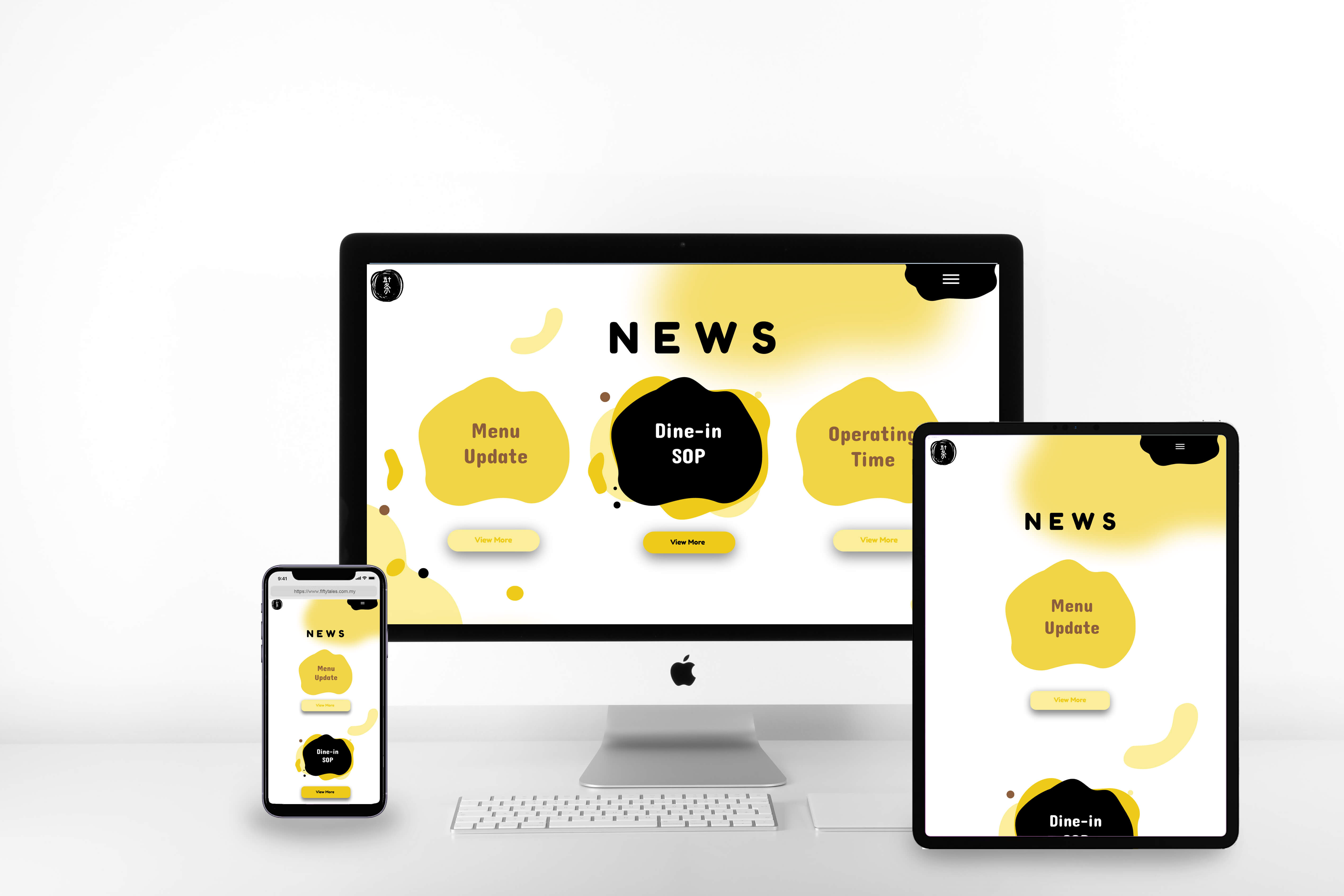
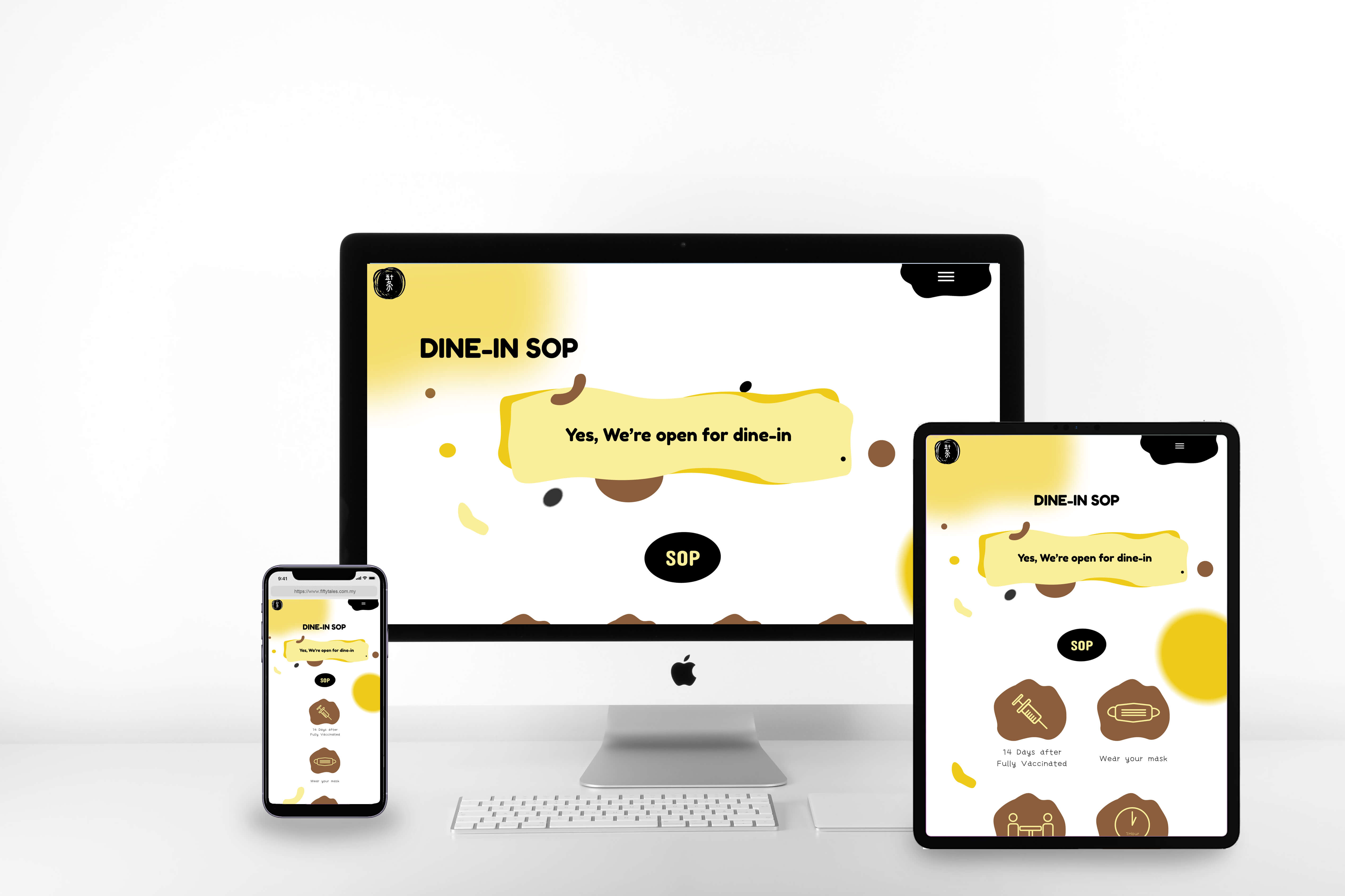
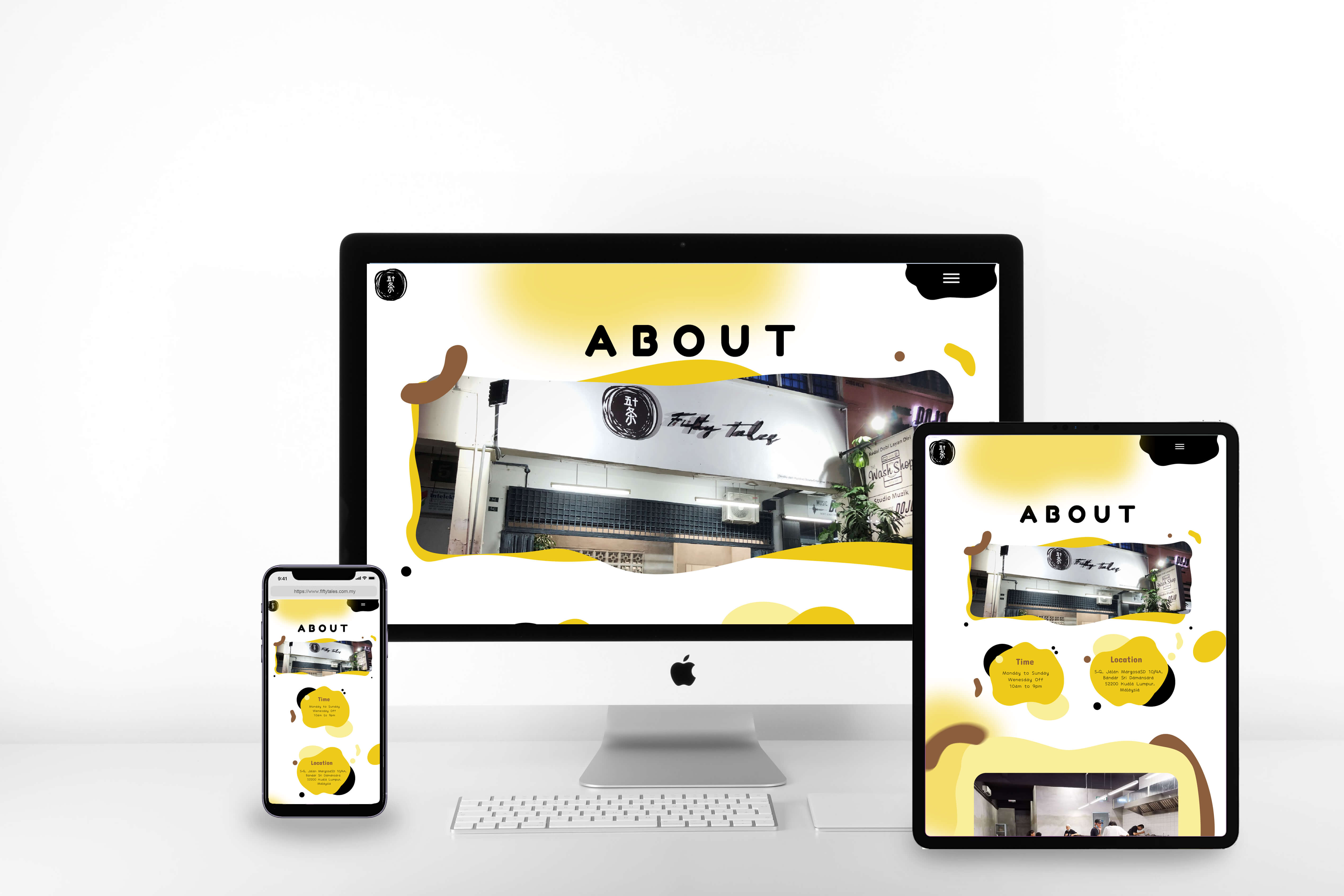
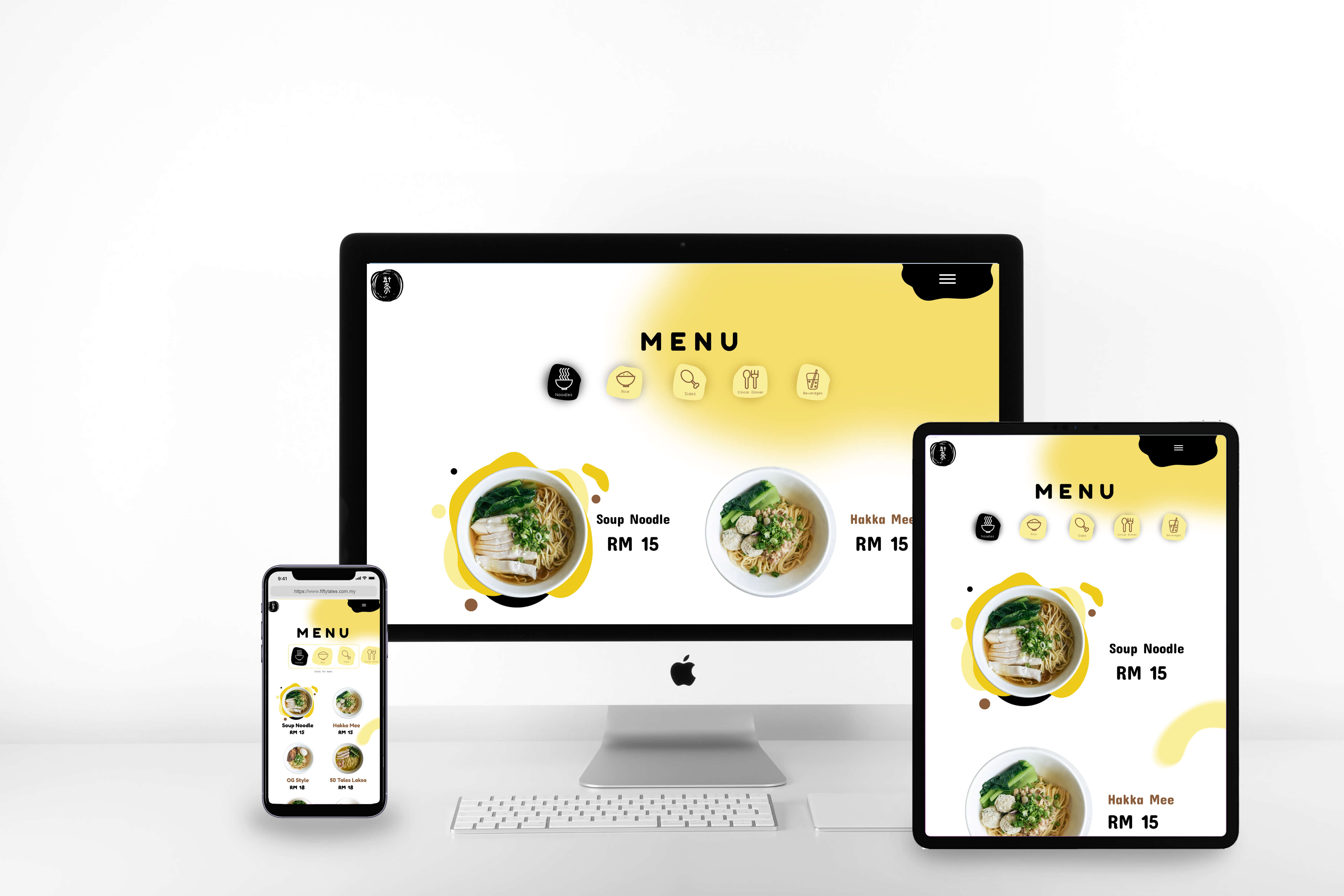
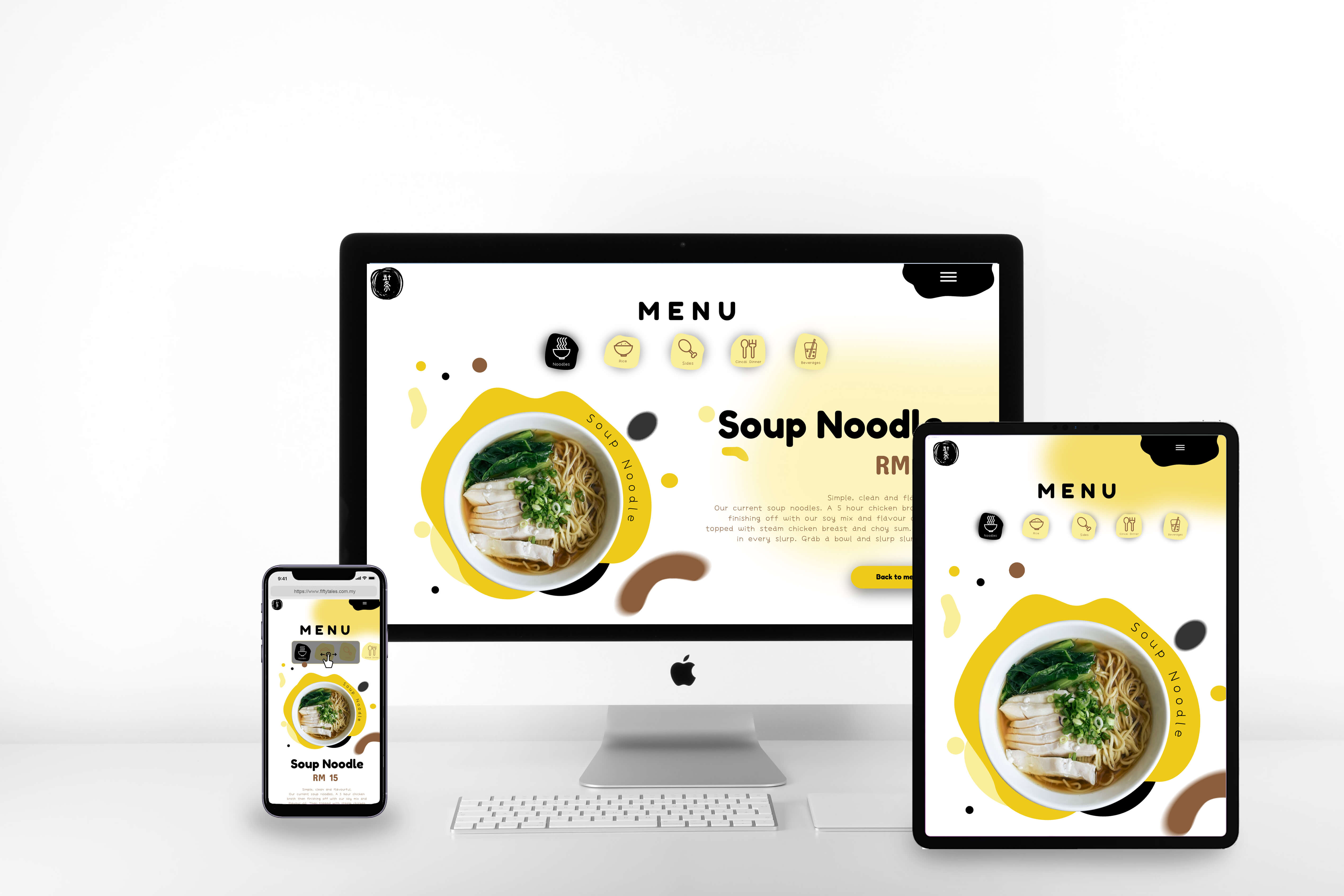
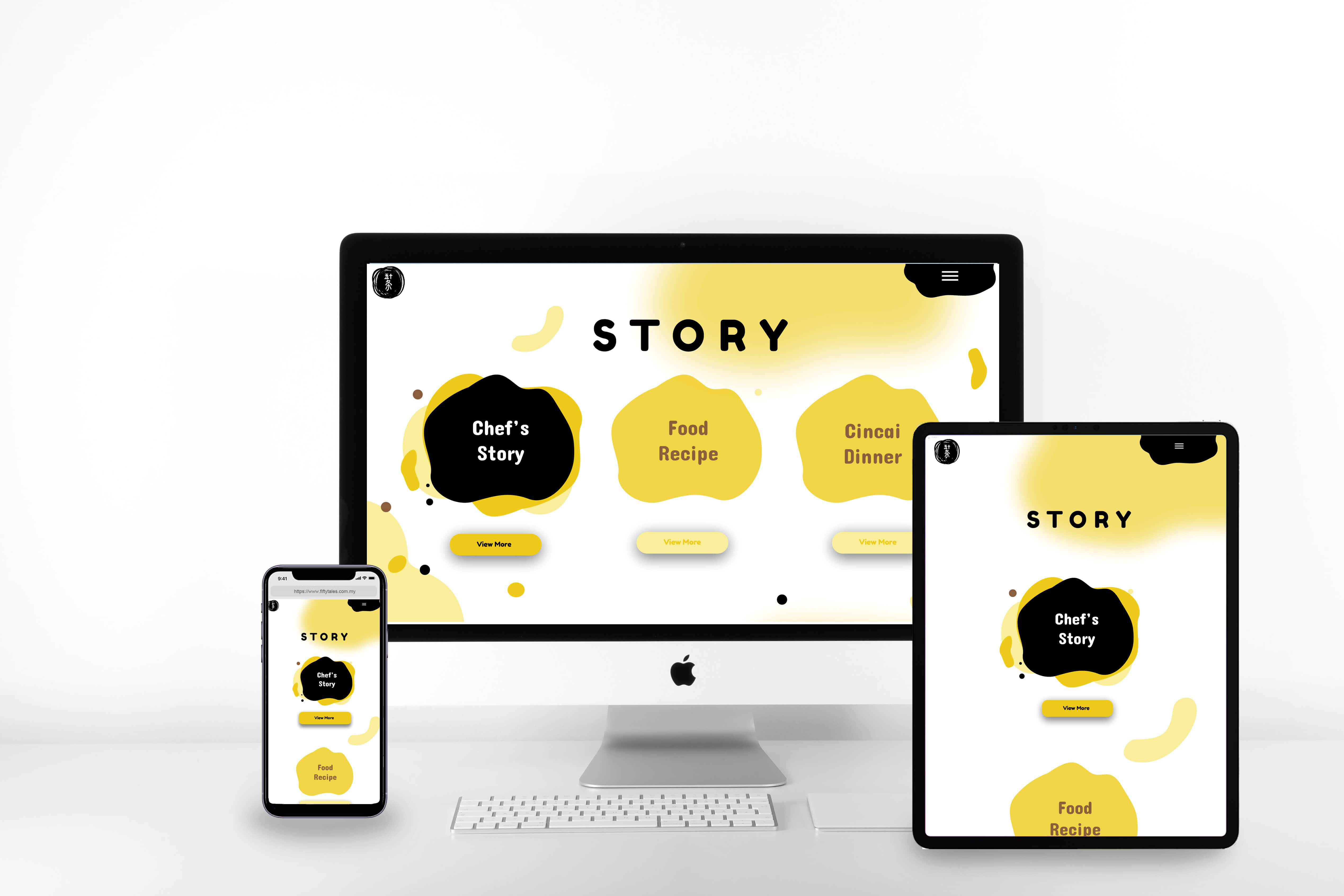
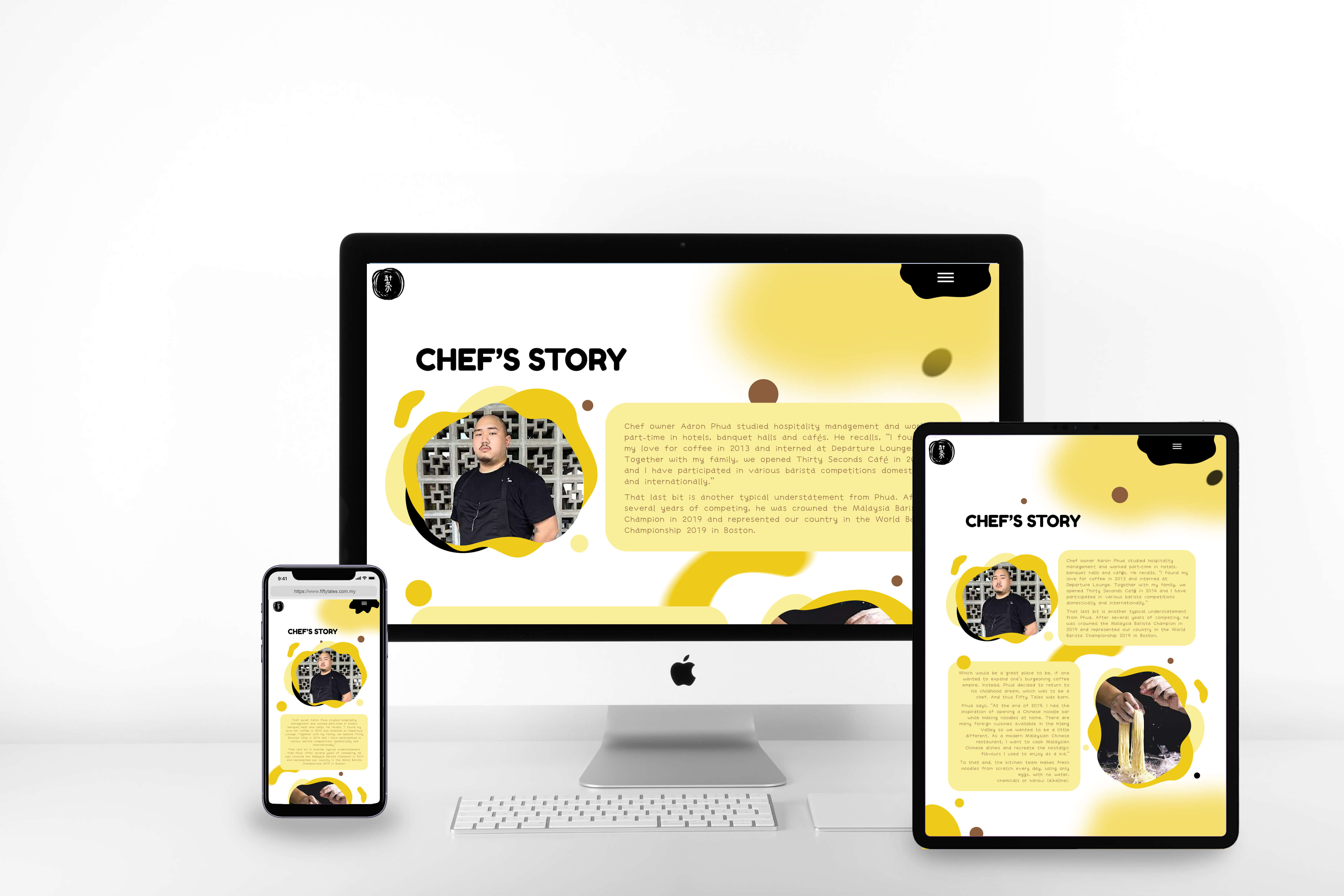
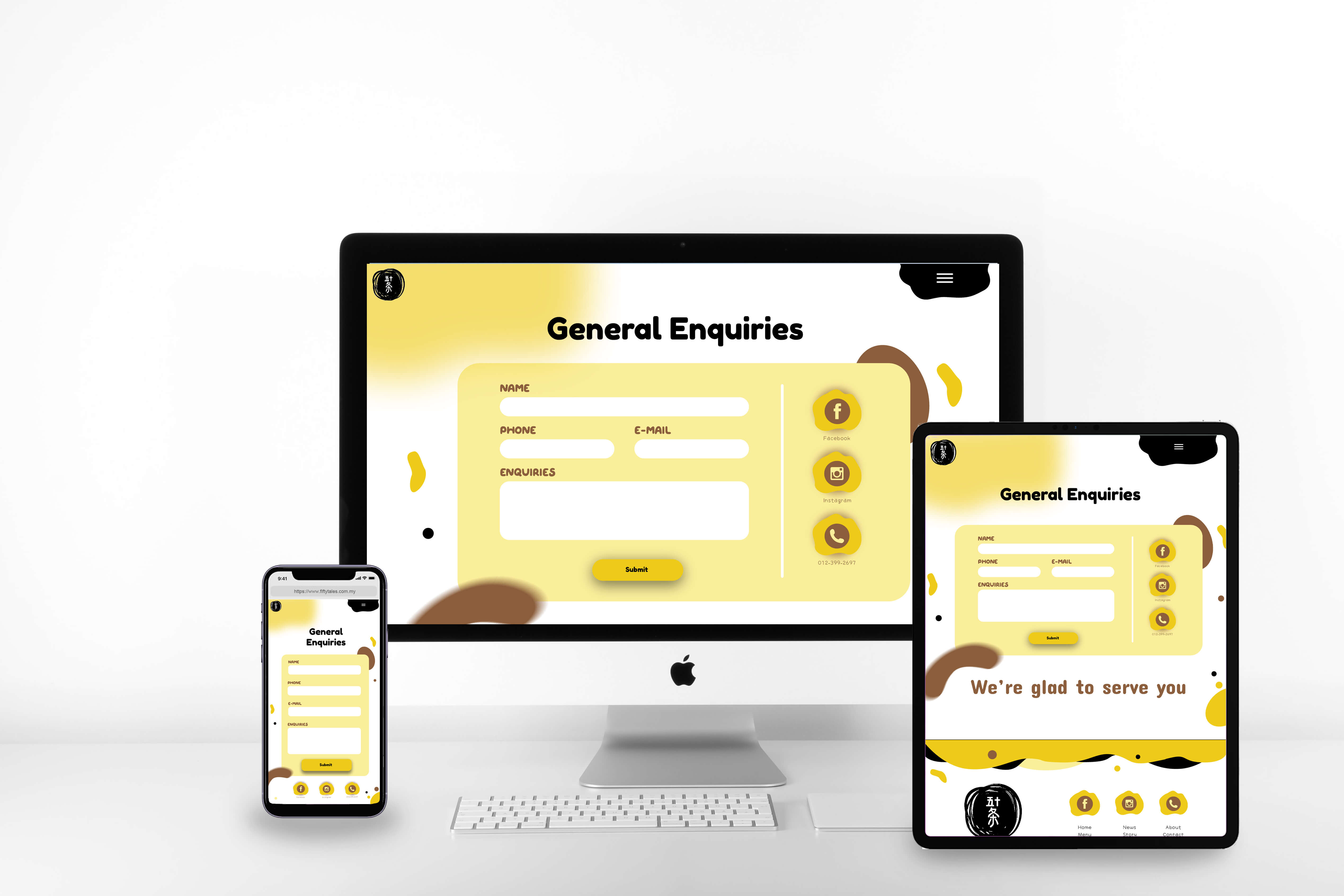
The Fifty Tales Noodle website takes a fun and inventive stance on conventional website design. Through a creative design approach that invites users to think beyond the box, the website design seeks to capture the soul of the brand. Yellow is used as an accent colour on the website, giving the black and white colour scheme a splash of colour. The usage of asymmetrical shapes is one of the website’s primary design components. To give the design more depth and interest, these forms are used all across the website. They are used to make distinctive backgrounds, borders, and other design components that distinguish the website. The website uses fun typography that complements the usage of asymmetrical shapes to further the design’s overall look. Key information is highlighted by the font, which also gives the design more aesthetic interest. The website has animated components that further the playful design approach by bringing the design to life. Visitors will find the design to be more interesting and memorable because to the usage of these animations, which give it movement and depth. As a whole, Fifty Tales Noodle’s website design takes a fresh and fun approach to web design. It combines a number of design components, such as animations, amusing typography, and irregular shapes, to provide visitors a distinctive and memorable experience.